Phone Mockup Styles Favored by Top SaaS Brands on Social Media
There’s a quiet visual war happening across LinkedIn feeds, product landing pages, and Instagram carousels. SaaS brands are competing not just on features — but on how their product looks before you even click “Sign Up.” And at the center of this battle? The humble phone mockup.
Why SaaS Brands Obsess Over Phone Presentation
Screenshots are dead. Or at least, raw screenshots are. Modern SaaS marketing teams understand that context creates desire — and showing your app inside a beautifully rendered device tells a story that a flat PNG simply cannot.
When Notion, Linear, or Figma drop a new mobile feature, they don’t just post a screenshot. They wrap it in a device that feels tangible, place it against a thoughtful background, and let the product speak from inside something people recognize from their pocket.
The mockup is the first impression.
The Dominant Styles in 2024–2025
SaaS brands have gravitating toward several distinct visual languages when presenting mobile UI:
1. Floating Minimal Clean white or near-white backgrounds, single device centered, generous negative space. Brands like Loom and Intercom favor this approach — it communicates clarity and focus, mirroring the product’s own UX philosophy.
2. Multi-Device Layered Two or three phones arranged in an overlapping cascade, often showing different screens of the same user flow. Slack and HubSpot use layered compositions to suggest feature depth without overwhelming the viewer.
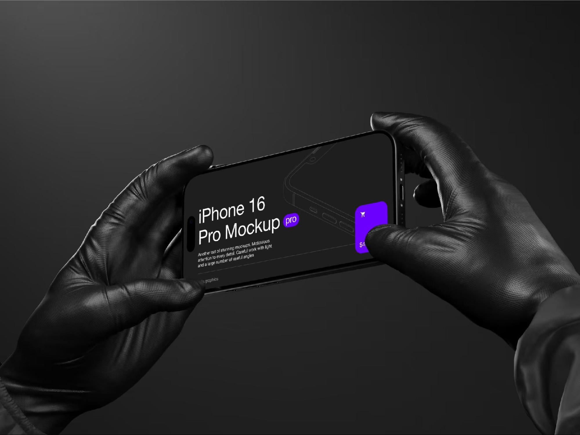
3. Dark Mode Cinematic Deep charcoal or true-black environments with dramatic lighting catching device edges. Notion and Linear have leaned into this heavily — it reads as technical, premium, and developer-friendly all at once.
4. Lifestyle Contextual The device appears in a real-world setting — on a desk, in a hand, beside a coffee cup. Calendly and Zoom use this style for paid social, bridging product and human story.
Real-World Examples: How Brands Use Mockups in Practice
Theory is one thing — execution is another. Here’s how leading SaaS companies actually deploy phone mockups across channels:
- Figma uses isometric multi-device arrangements in its conference talks and release announcements, showing mobile and desktop simultaneously to emphasize cross-platform capability.
- Notion regularly pairs dark-mode phone mockups with ambient gradient backgrounds in its Twitter/X product updates — creating a mood as much as a message.
- Stripe leverages ultra-clean single-device mockups in its documentation and partner marketing, reinforcing its brand promise of simplicity and precision.
- Loom features lifestyle-style mockups in its paid social campaigns, with the phone held naturally in hand, making async video feel human rather than corporate.
- Linear consistently uses dark, edge-lit device renders in changelogs and feature drops — a deliberate aesthetic signal to its technical audience.
Each of these decisions is intentional. The mockup style is a brand statement.
Phone Mockups on ls.graphics
For teams serious about visual quality, ls.graphics has become a genuine go-to resource. Their phone mockup collections stand out for ultra-realistic rendering that holds up even at large display sizes. Files come with organized, clearly labeled layers — making it fast to swap in your UI without wrestling with unnamed groups.
The library covers a wide range of angles and perspectives, from straight-on flat lays to dynamic isometric views. Multiple color styles (black, white, titanium tones) are available within single packs. Compositions are styled with a confident minimalism that fits modern SaaS aesthetics out of the box.
A standout feature is Edit Online — letting you apply your screens directly in the browser without opening Figma or Photoshop. For marketers moving fast, this alone is worth it. And for teams not ready to commit, there’s a generous selection of free scenes available to explore before purchasing.
Conclusion
The visual standards for SaaS marketing have risen sharply. A polished phone mockup is no longer optional — it’s the baseline expectation for any brand that wants to be taken seriously on social media. The style you choose communicates your positioning before a single word is read.
Whether you’re launching a new feature, running paid ads, or refreshing your landing page, investing in high-quality device presentation pays visible dividends. Resources like ls.graphics make it easier than ever to achieve that premium look without a full-time motion designer on staff. Use the craft well — your product deserves a presentation that matches its quality.